
Instagram today announced the debut of a new application called Layout, the company’s next standalone creation tool outside of its flagship photo-sharing application. With Layout, Instagram users will be able to quickly build collages using their mobile photos, which they can then choose to share to Instagram, Facebook, or elsewhere.
Collage-making is already a popular activity on Instagram, the company tells us. One in five monthly active users on Instagram use a collage app at least once, we’re told. Today, the app stores are filled with utilities that offer this sort of capability – including apps like Pic Stitch, Pic Collage, InstaCollage, PhotoGrid, and many others. The apps are all similar in nature – they offer a variety of blank photo grids which users can customize with their own photos, and sometimes optional text or stickers.
To Instagram’s credit, it didn’t just knock off the existing collage-making apps already on the market, but instead tried to come up with an app that would improve the experience for mobile users.
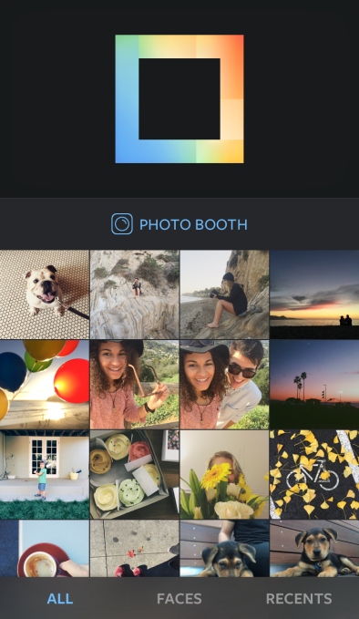
In Layout, Instagram offers a new take on how collages are built by changing the order of the steps involved in the process.
“The first thing you see is a view of the Camera Roll,” explains Joshua Dickens, Product Designer at Instagram. “Most apps give you a bunch of empty grids. But more important is choosing the photos you want to share, before you lay them out,” he says.
As you tap to select the photos you want to use, Layout then presents previews of custom layouts you can scroll through at the top of its screen. You can select up to nine photos using Layout, and each time to tap to add another, your photo grid options update automatically to reflect the new additions. When you’re finished adding images, you can then flick through the presented options to choose the grid you like the best.
Faces
Another interesting feature in the collage-building process is the ability to tap onto a “Faces” button at the bottom of the screen to filter your Camera Roll to show only those photos with pictures of people. 90% of photos used in collages have faces in them, Instagram found, so this option will be useful to those who are filling their grids with photos of friends and family, instead of just cityscapes, objects, or other scenery.
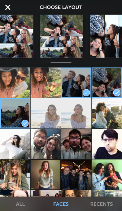
Photo Booth
There’s also a “Photo Booth” button that lets you use Layout to capture more spontaneous moments. When you tap this button, the app starts a countdown timer and then captures a series of photos that you’ll see appear instantly in a layout.
Having used a number of the photo collage apps in the past, I found that the way Layout flipped the first few steps involved with making a collage – that is, first selecting the photos, then choosing the grid – significantly sped up the previously time-consuming process of collage building. For example, I was able to quickly create a few photo collages in a matter of seconds over the weekend – in the middle of a six-year old’s chaotic birthday party, of all places. In the past, the same activity using an app like Pic Stitch would have required a lot more time and trial and error to find the right grid and the best photos to use. With Layout, however, the process wasn’t just fast – but the learning curve to figuring out how all the features worked, too, was greatly reduced.
Grid Options
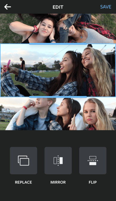
Like other collage builders, Layout also allows you to pan the photos as well as pinch and zoom to better situate them. Plus you can grab the handles of a photo to resize it in the grid you’ve chosen, making it larger or smaller in relation to the others. A “replace” button lets you quickly pull up your Camera Roll again in order to swap out photos, which can be done with just a tap.
Swapping out photos all takes place on the same screen, too. Some apps I’ve used in the past would pop up the Camera Roll view in its own window, which made it difficult to think about which photo would look right in your current grid option. I preferred the way Layout does this instead.
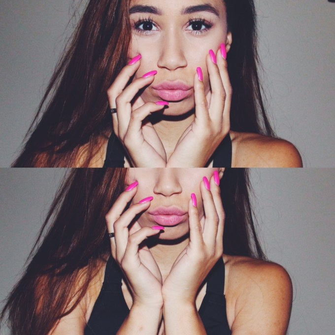
Layout also offers a few differentiated tools, including the ability to tap buttons that flip images upside down or make photos mirror each other. This allows for more artistic creations, like turning landscape shots into ones with a cool water effect – where the land and sky seems to be reflected into a glassy pool, for example. It also offers a way to do more fun, “pop art” style shots, which could serve to spice up selfies or the popular “outfit of the day” shots many Instagram users post regularly.

When you’re finished with your collage, you can save the photo locally, share to Instagram, Facebook, or to other services whose apps you may have installed on your iPhone through iOS’s included sharing options.
Instagram had been researching the possibilities for an app like Layout since last fall, and the app itself has been in development over the past few months. Like its video app Hyperlapse, the company built Layout not to generate additional revenue for the company – there are no in-app purchases for things like more photo grids or effects, nor will it monetize through ads – but rather to encourage more photo-sharing to Instagram by fixing the problems with today’s current collage apps.
With the debut of Layout, it appears that the Facebook-owned company, which now sports over 300 million active users monthly, is working to find ways that allow it to keep its main app simple for its core audience, while also meeting the needs of more advanced users who are in search of better tools for working with their photos and videos. This fits in with the trend where Instagram has been looking at what other apps people are using as companions, and then trying to build the functionality itself, sometimes in Instagram’s core product, and other times as standalone apps, as with Hyperlapse.
“A key part of the Instagram vision is about inspiring creativity,” notes John Barnett, Product Manager at Instagram. “Creation should be simple, intuitive and fun,” he adds.
Layout is currently an iOS application, but an Android version will be released in the months ahead.

No comments:
Post a Comment