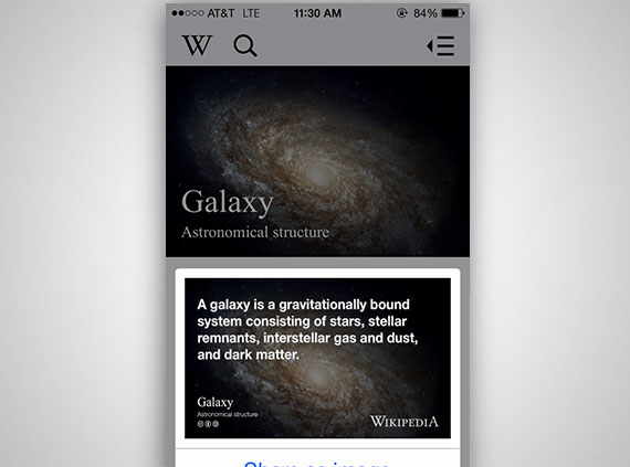
The Wikimedia Foundation has been steadily rolling out updates to the Wikipedia mobile experience in recent months, and today that trend continues as the organization rolls out a brand-new iOS app. This release is focused on improvements to the visual design of Wikipedia’s app, better search, and includes the addition of social features that allow you to share facts and images with friends on social networks, including Facebook, Twitter, Google+ and elsewhere.
While Wikipedia today sees nearly half a billion monthly visitors accessing its online encyclopedia’s over 34 million articles that span 288 languages, its deep integration into the iOS operating system is both a blessing and a curse. While it’s great to be able to quickly access Wikipedia content by way of Spotlight search and Siri, that also means that users have less reason to visit the native app directly when there’s something they need to research. And with an ever-growing number of mobile applications available for download from the App Store, it can be difficult to make the case for something as utilitarian as Wikipedia to remain on your phone’s homescreen…or second screen…or third.
To some extent, that’s why the Wikimedia Foundation has been rolling out these updates to its mobile application, with the goal of making its native version more attractive, easier to use, and generally more engaging. The idea is to make the app something that’s compelling enough to pop into from time to time, even if you’re not actively searching for a topic.
Things like the app’s “Random” feature, which suggests an interesting article for reading, and the app’s “Nearby” option, which includes articles that suggest content related to your current location, have for some time offered different ways to interact with Wikipedia, for example.
With today’s update, the app has been improved to make accessing its content easier and quicker than before, with consideration to mobile users’ limited time and smaller screens. The app now sports a cleaner design with a short descriptor of the topic right at the top of the screen that makes it possible to get a simple answer within seconds. Many articles are now also preceded by a large image, giving the app more visual interest.
Meanwhile, the app’s search functionality has been improved with a higher contrast search bar and support for showing your recent searches.
Once immersed in the app, Wikipedia has made changes subtly designed to keep you there – specifically, to keep you exploring topics and reading more. To that end, each article will now have a section at the bottom that encourages this behavior, connecting you to other information on the topic at hand. And an enhanced image viewer helps visual learners swipe through all the article’s images more easily.

The app is also now going social with a feature that lets you create images overlaid with text from an article that can be shared with anyone via social media like Facebook, Twitter, Google+, email or text, and more. Previously released on Android, this clever addition lets you share a fact with your friends. It’s an attempt at making Wikipedia something that’s more fun and social – a toy of sorts, not just a tool.
It’s actually a handy tool to use when having those sorts of arguments that can be won by way of Wikipedia searches. Instead of just texting or posting a link to the article and citing the factoid that proves your point, you can build these “fact cards” using the main image from the article and your highlighted text. Now, not only have you won the point, you’ve won with style, it seems.
The updated app is rolling out now on iTunes.

No comments:
Post a Comment